
OutFitness came my way in June 2022 as a referral from a previous client, DYKON.
OutFitness is an inclusive fitness facility based in Austin, TX. Their goal is to create an environment of allyship and togetherness through fitness and health. Owner Sydney was looking to revamp the logo -- preserving the original idea of a Pride-colored barbell, while refining and updating the look.
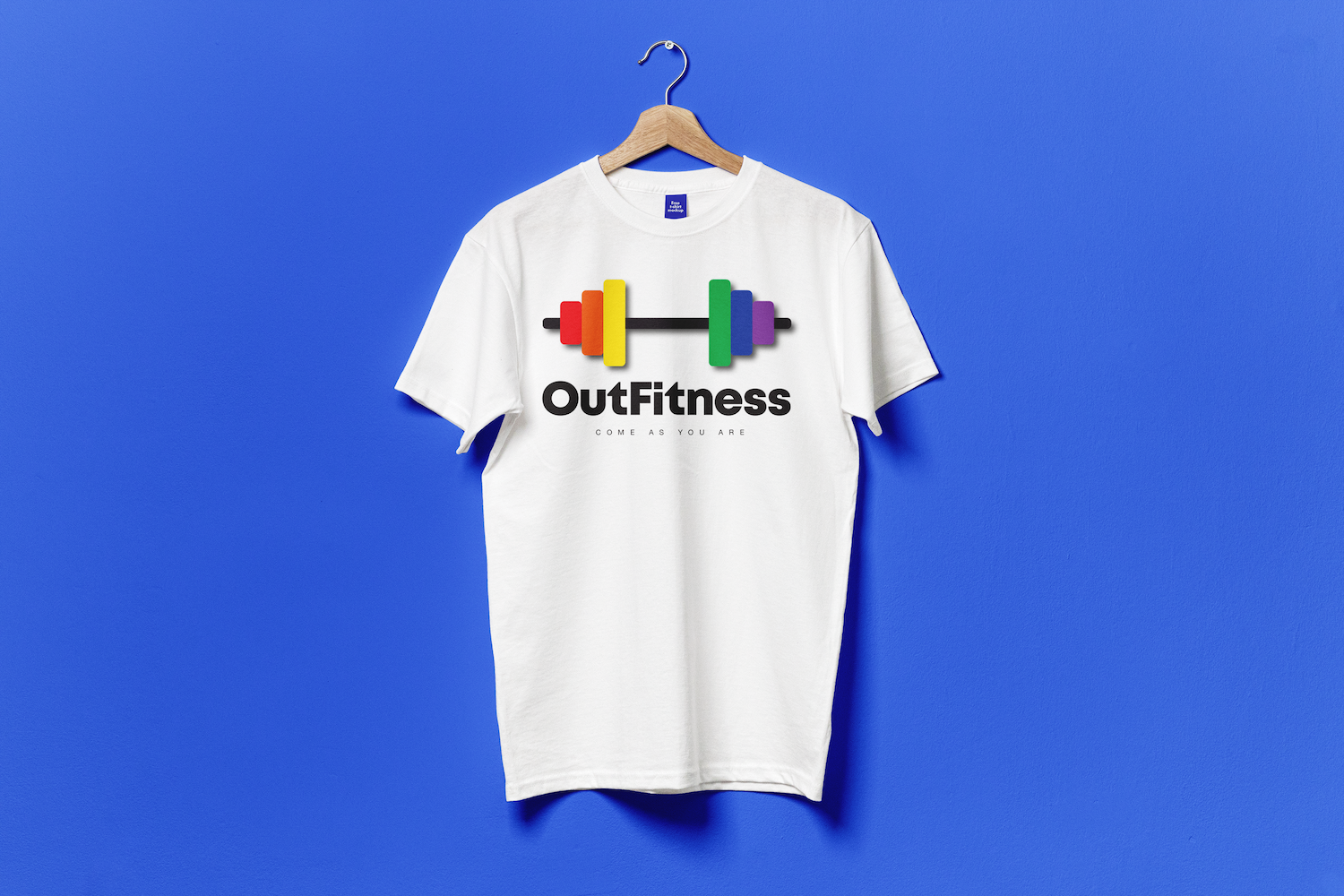
We both agreed that the original feel of OutFitness' logo was great. I opted to lengthen the bar and round the edges, creating a softer, less harsh image. I also brightened and simplified the colors and assisted in capitalization refinement of the name, shifting from OUTfitness to OutFitness.
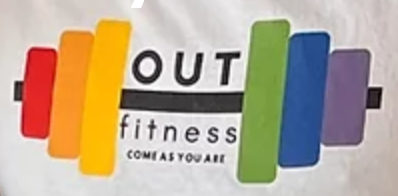
Old
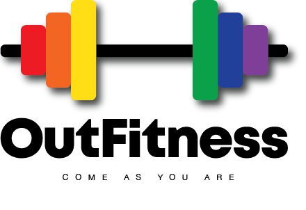
New
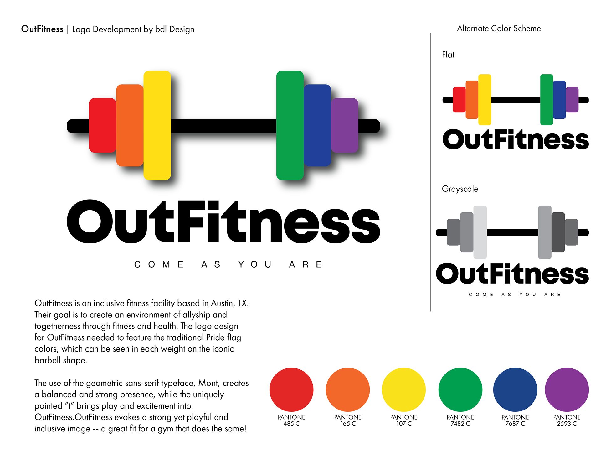
The use of the geometric sans-serif typeface, Mont, creates a balanced and strong presence, while the uniquely pointed “t” brings play and excitement into OutFitness. OutFitness evokes a strong yet playful and inclusive image -- a great fit for a gym that does the same!