
DYKON Apparel is an up-and-coming inclusive clothing brand that contacted me for a logo design package in August 2020.
During our initial consultation, I learned about the owner's motivations around starting an inclusive clothing brand and their desire to create a logo that was strong, bold, and unashamed.
Armed with the starting point of crown iconography, I set to work creating sketches and iterations of designs. I settled on three distinct rough designs, which I sent the the client for our first round of review, critique, and edits.
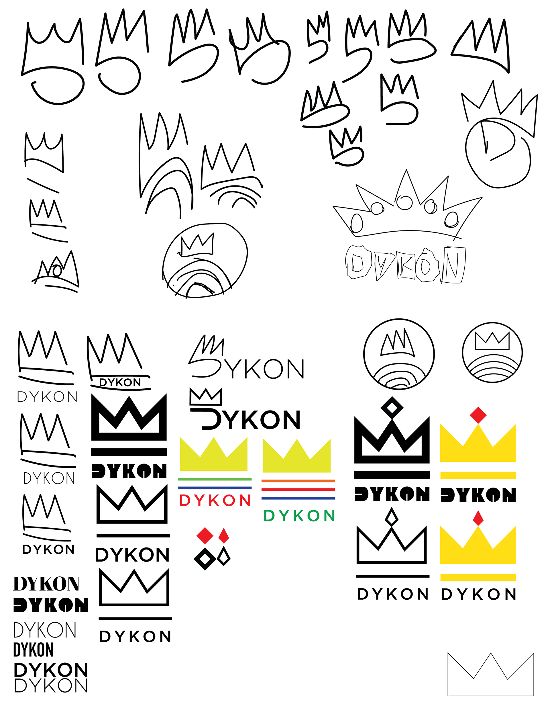
Early sketches and iterations of logo design for DYKON
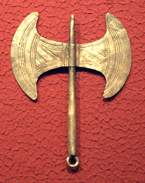
After round 1, the client sent along this photo of a labrys with the hopes of incorporating it into the design, as it serves as an important symbol in the queer and lesbian communities -- their target demographic.
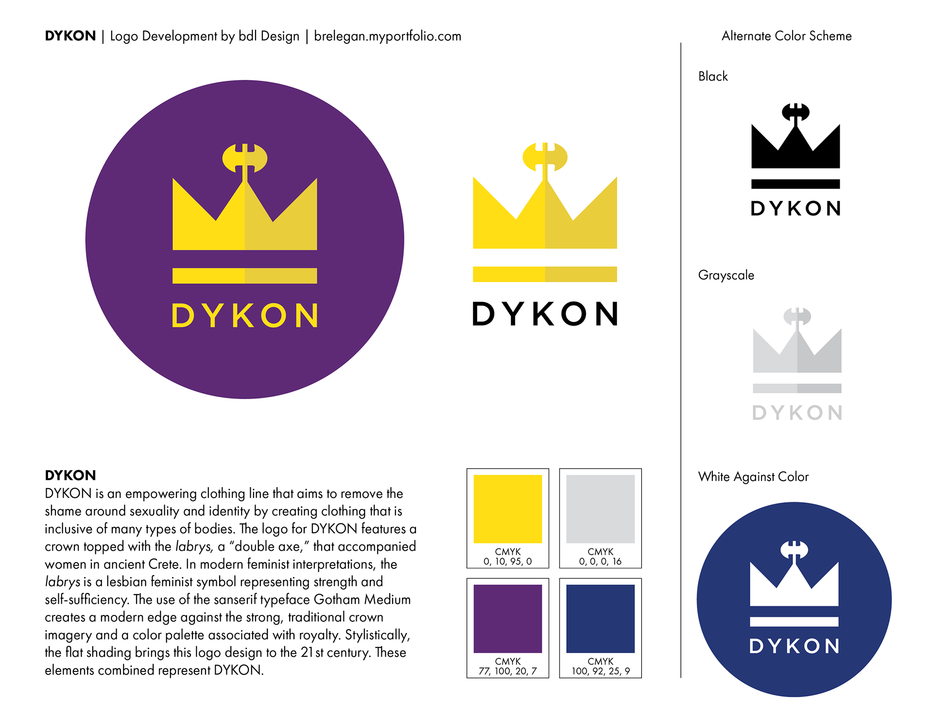
I built a flat shape inspired by the bold curves of the double axe and placed it on top of the chosen crown shape and design.
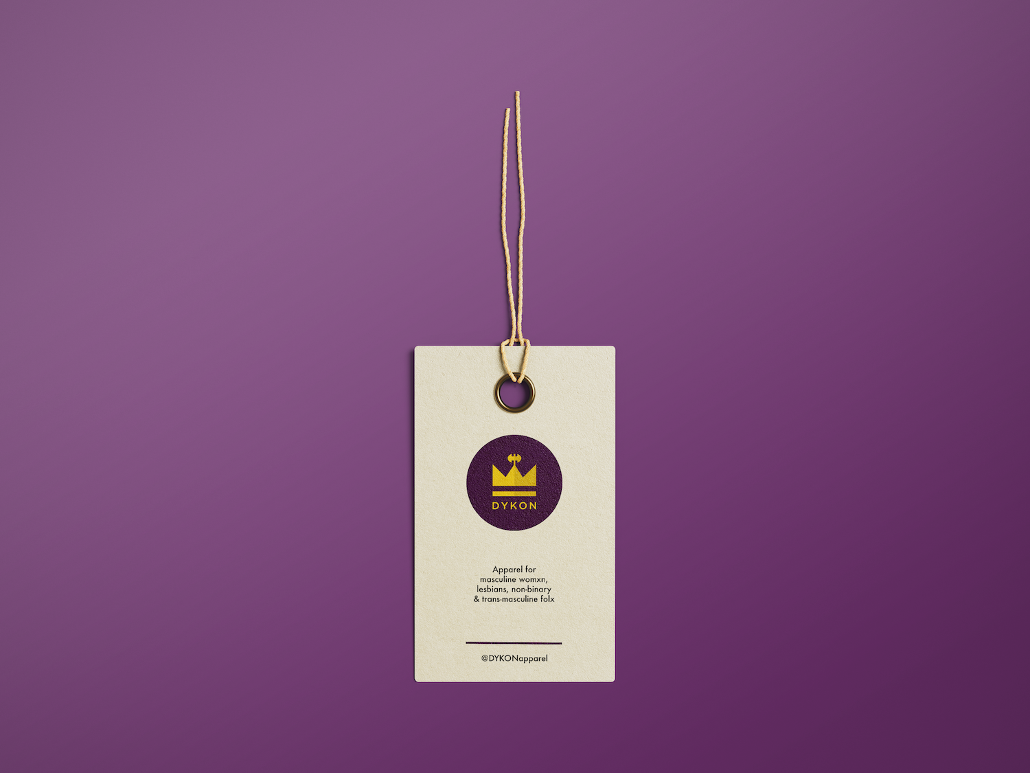
We nailed the look by round two of edits and proofing!
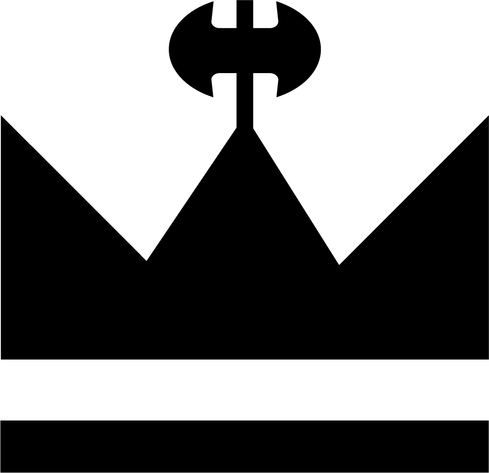
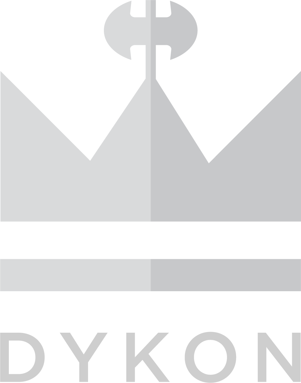
My logo packaging includes a write up of rationale behind design choices and final presentation board (above), three different file types (PNG, PDF, SVG) for each iteration of the logo, and a handy guide on how to use the file types and iterations.
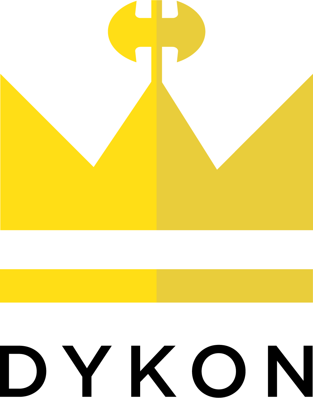

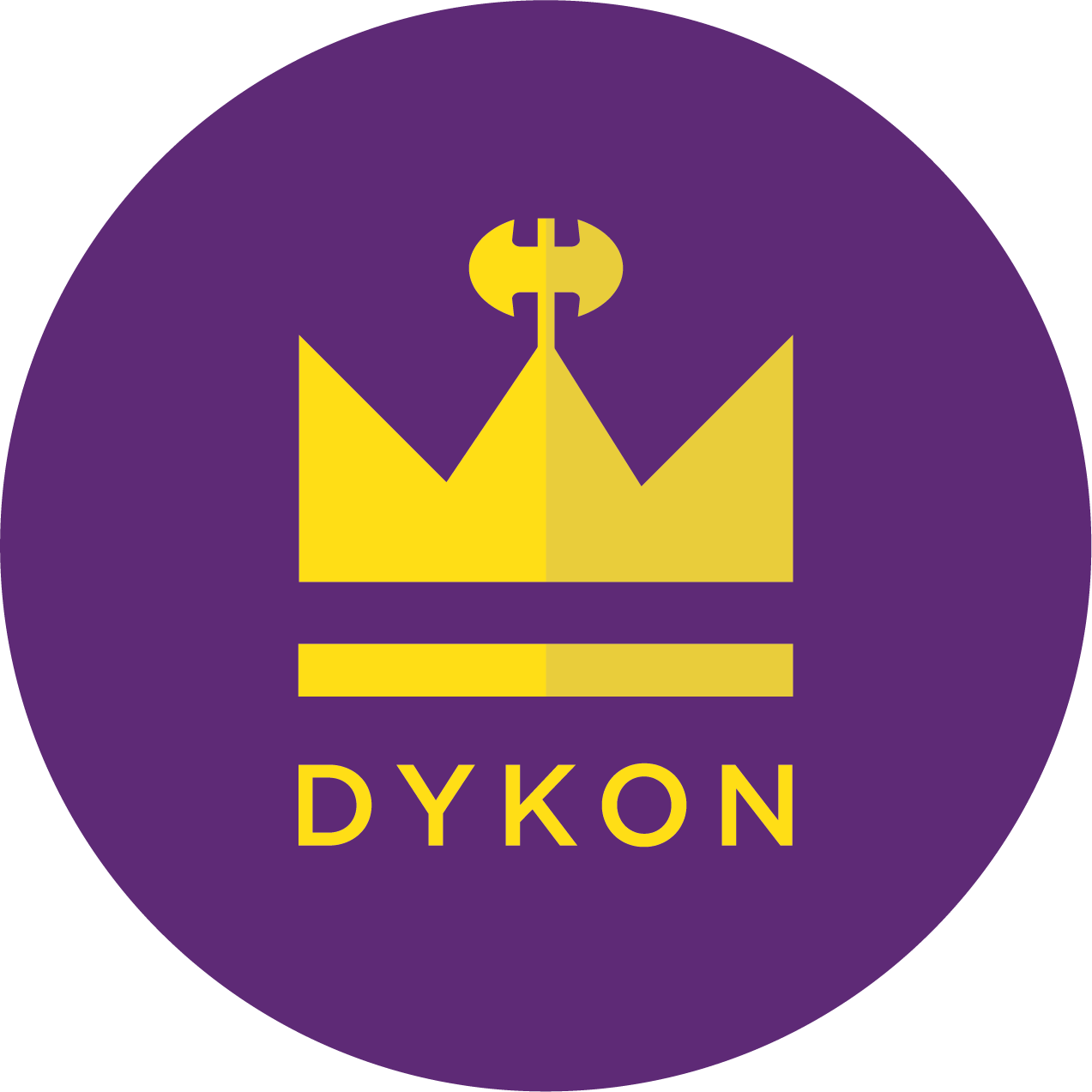
"DYKON is an empowering clothing line that aims to remove the shame around sexuality and identity by creating clothing that is inclusive of many types of bodies. The logo for DYKON features a crown topped with the labrys, a “double axe,” that accompanied women in ancient Crete. In modern feminist interpretations, the labrys is a lesbian feminist symbol representing strength and self-sufficiency. The use of the sans serif typeface Gotham Medium creates a modern edge against the strong, traditional crown imagery and a color palette associated with royalty. Stylistically, the flat shading brings this logo design to the 21st century. These elements combined represent DYKON."