
One of my favorite graphic design classes I took during my undergraduate career at Drury University was called Posters: A Shout to the Eye, a 300-level ARTZ course, during the spring semester of 2016. We studied the theory of poster design, from the psychology of color to the interaction of negative space on a page, history and early pioneers of poster making, and of course tried our hand with intentional project assignments.
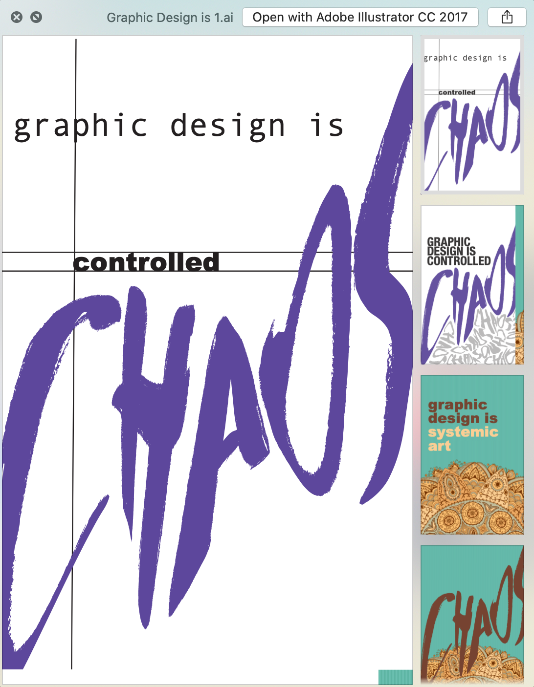
We started the semester with a 30-minute challenge, which I still remember so vividly, years later. We were asked to create several cohesive drafts of "what graphic design is" and while I've still not answered that question, it really set the tone.
I was really into text manipulation during this course, and played around with a handwritten typeface (I later used this typeface for Ramble Magazine!).
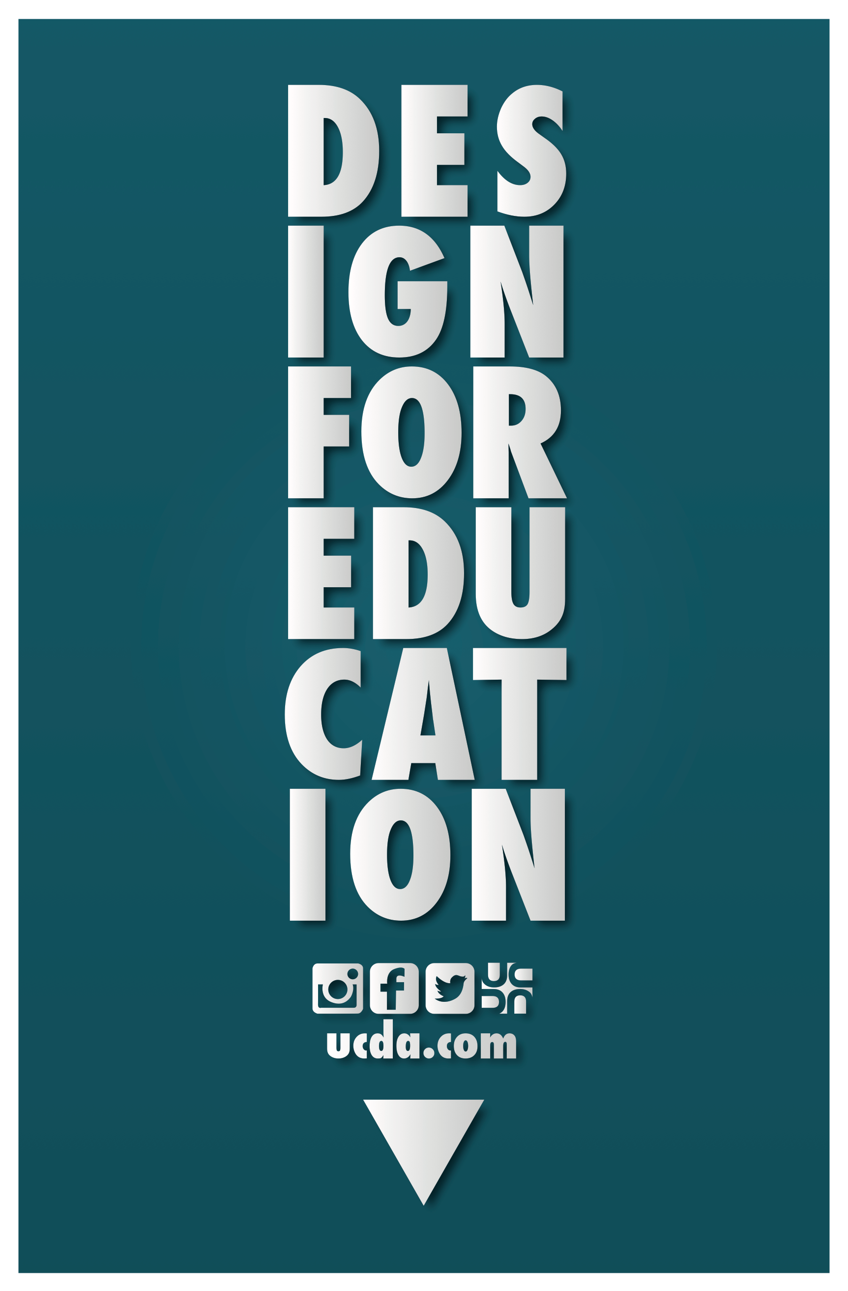
Our first "real" project was to create an entry in University & College Designers Association (UCDA)'s "Design for Education" competition. The competition posed, "If you share this belief that design matters, and that university designers and design educators can make a powerful impact in the world, we encourage students to create a poster that visually communicates this idea loud and clear!"
I decided to create well-aligned text within the shape of a pencil and challenged myself to learn how to mimic the appearance of 3D metallic icons and lettering. I wanted to use this creative direction to imply how cutting edge education must be for an increasingly busy and demanding world.
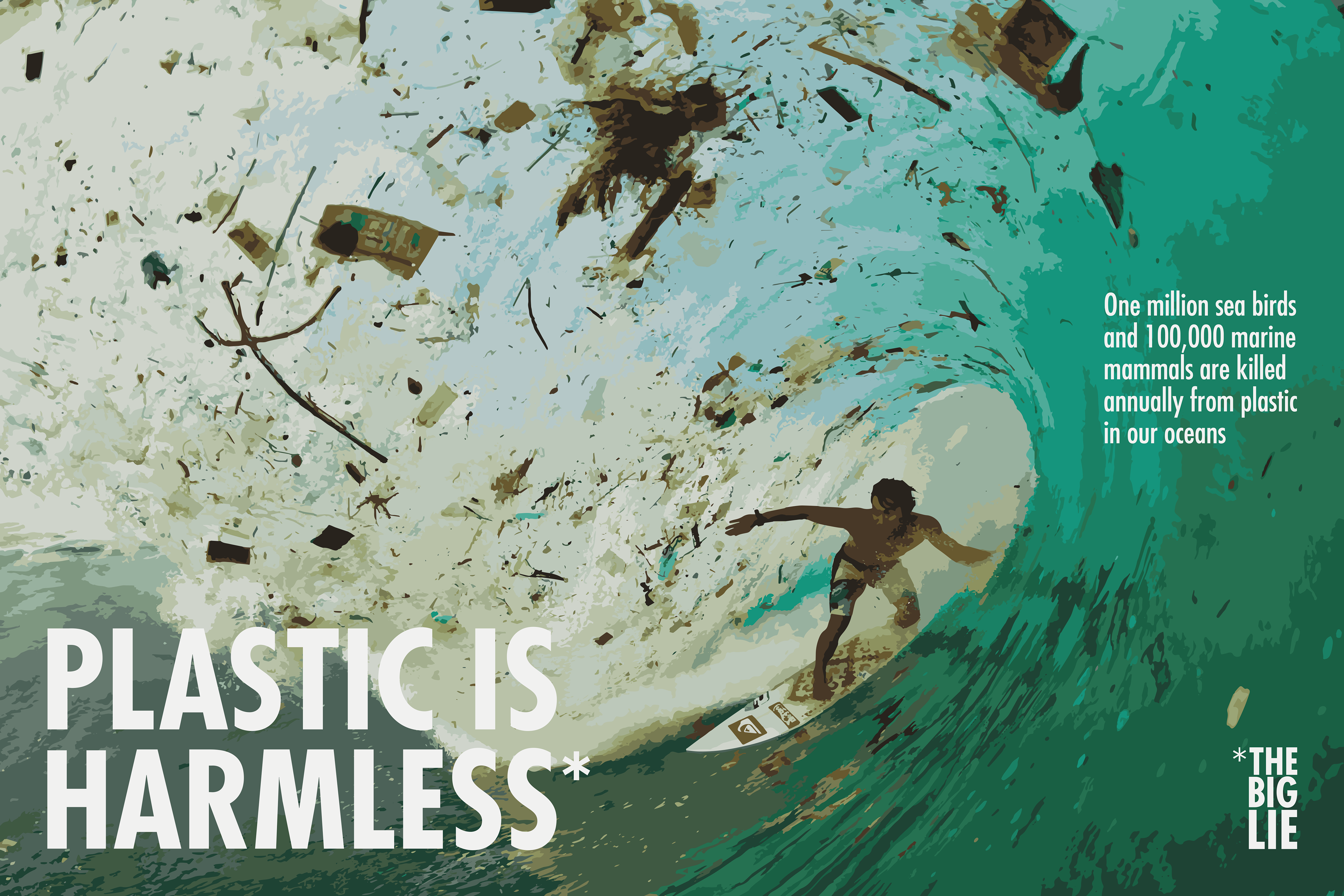
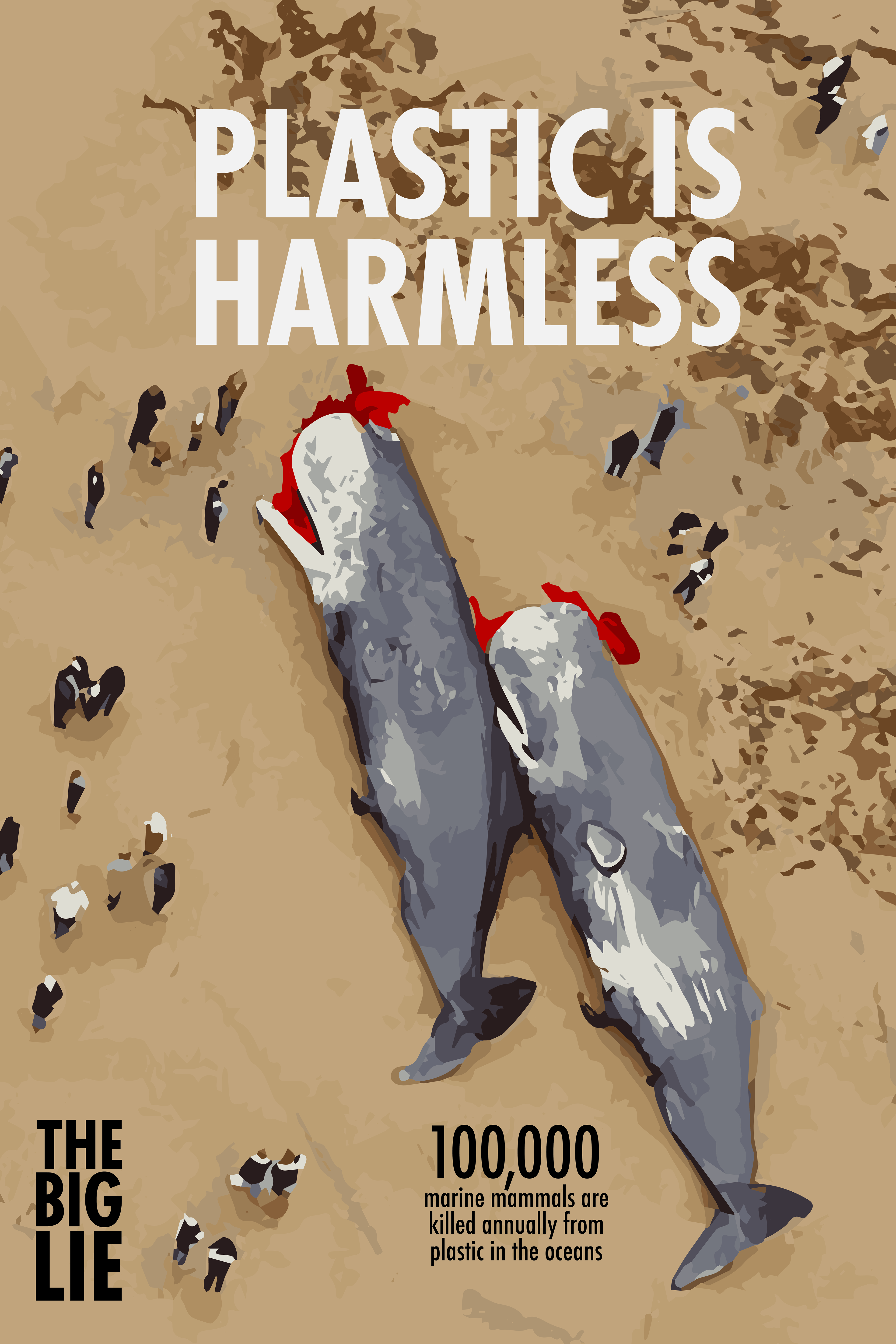
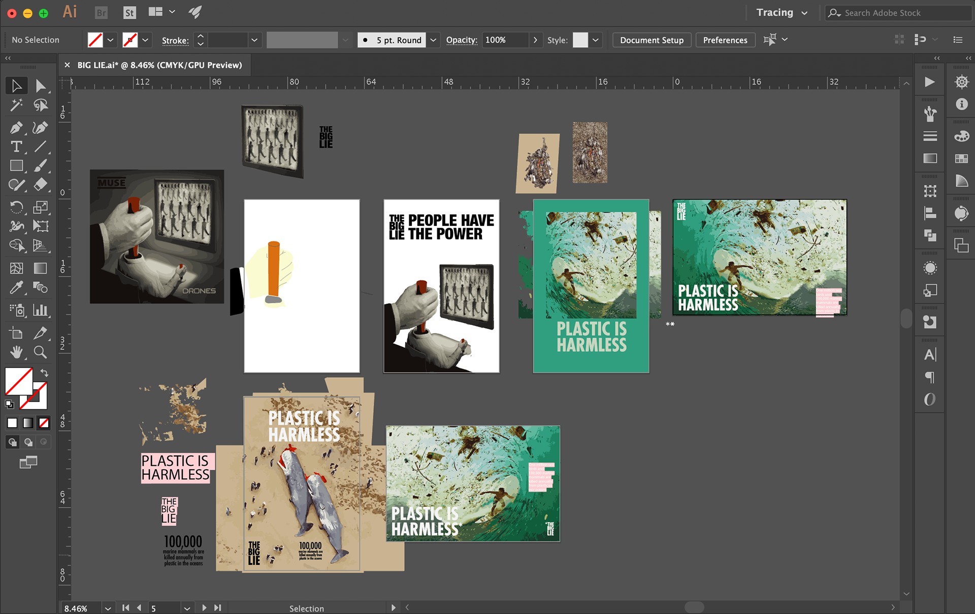
We were next tasked to think of "The Big Lie" in the world and illustrate this lie. I worked through several ideas of what "The Big Lie" might be (as evidenced from my AI workspace below), before settling on "Plastic is Harmless." I found a few photos online with compelling imagery and used the Image Trace function to create detailed illustrations of the scenes. I refined the illustrations and worked with typography, settling on two final drafts. Ultimately, I chose to move forward with the surfing poster as the final design because of the effective composition of the poster, with the circular shape and dynamic movement of the image helping to focus attention on the call to action.
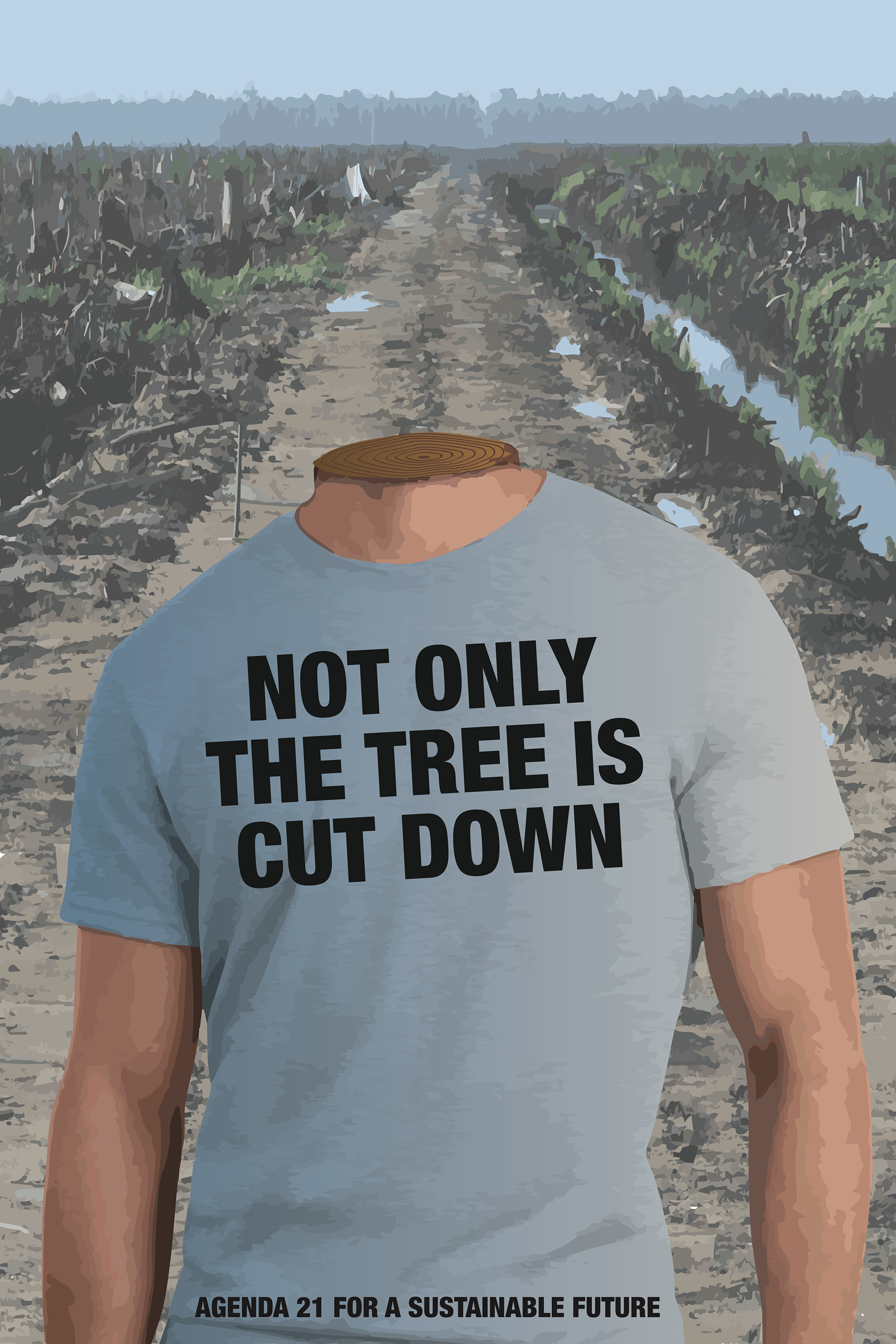
My professor often presented political concepts for us to research and create content for. One of his favorite topics that semester was Agenda 21, a voluntary action plan penned by the UN that offers suggestions for sustainable ways local, state and national governments can combat poverty and pollution and conserve natural resources in the 21st century.
We were challenged to read sections of the 351-page document, decide where we stand, and advocate a position through a poster. I picked a section under Conservation and Management of Resources for Development, particularly on combating deforestation.
I wanted to create a powerful image that would shock viewers and demand action. For this reason, I elected to use the slogan “Not only a tree is cut down” with an image of a decapitated man with a tree stump at the neck and an area of clear-cut forestry in the background. I want to use decapitation as a way for the audience to realize that the incessant cutting down of trees does not only result in the loss of forests, but of many other things, including the eventual loss of human life.
This project stretched my technical skills beyond what I was capable of at the time, and I ended up using a combination of Photoshop and Illustrator to get the final image.
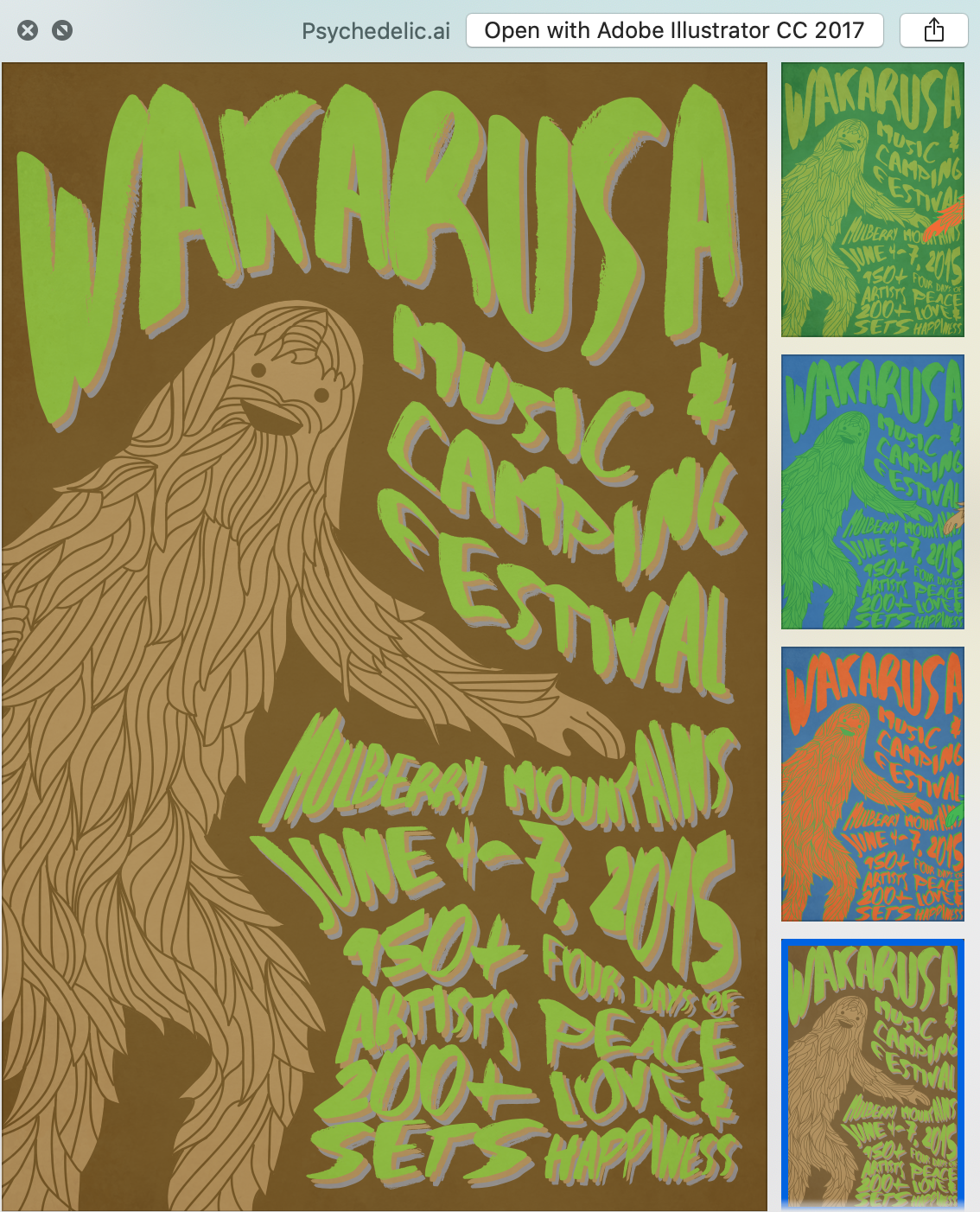
We studied psychedelic posters from the 60s and 70s, learning about screen printing and design techniques unique to that era. We learned about hand drawn typefaces and how to alter text in Illustrator with a variety of approaches and tools. We also discussed color theory and the power of contrasting colors to create eye-popping work.
I created a poster for a music festival I attended the previous summer, Wakarusa (RIP). In the end, I chose the brown background for maximum accessibility with vision and to convey the grassroots, natural, backwoods feeling of the fest.
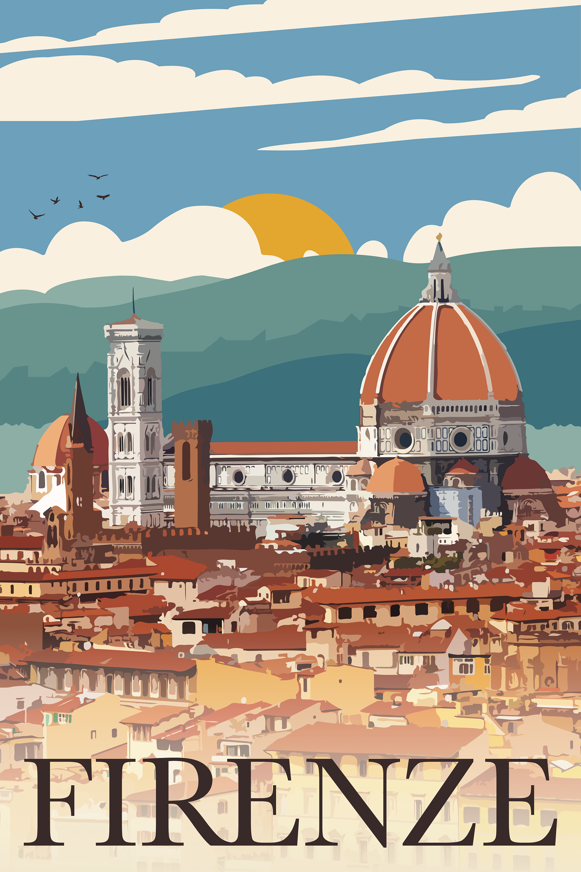
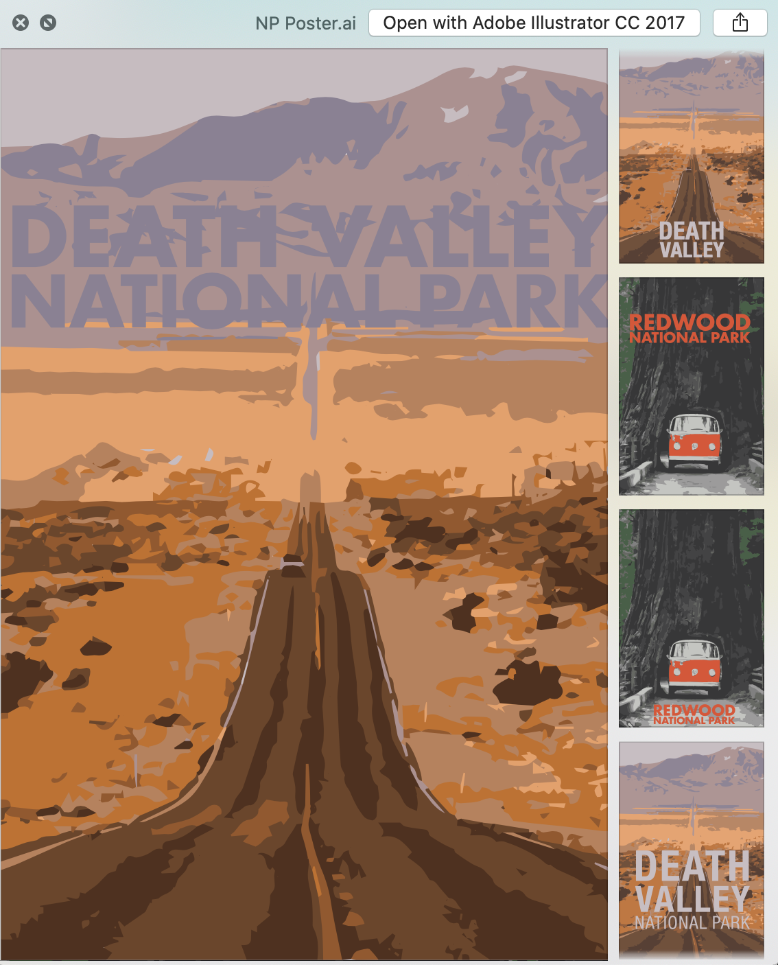
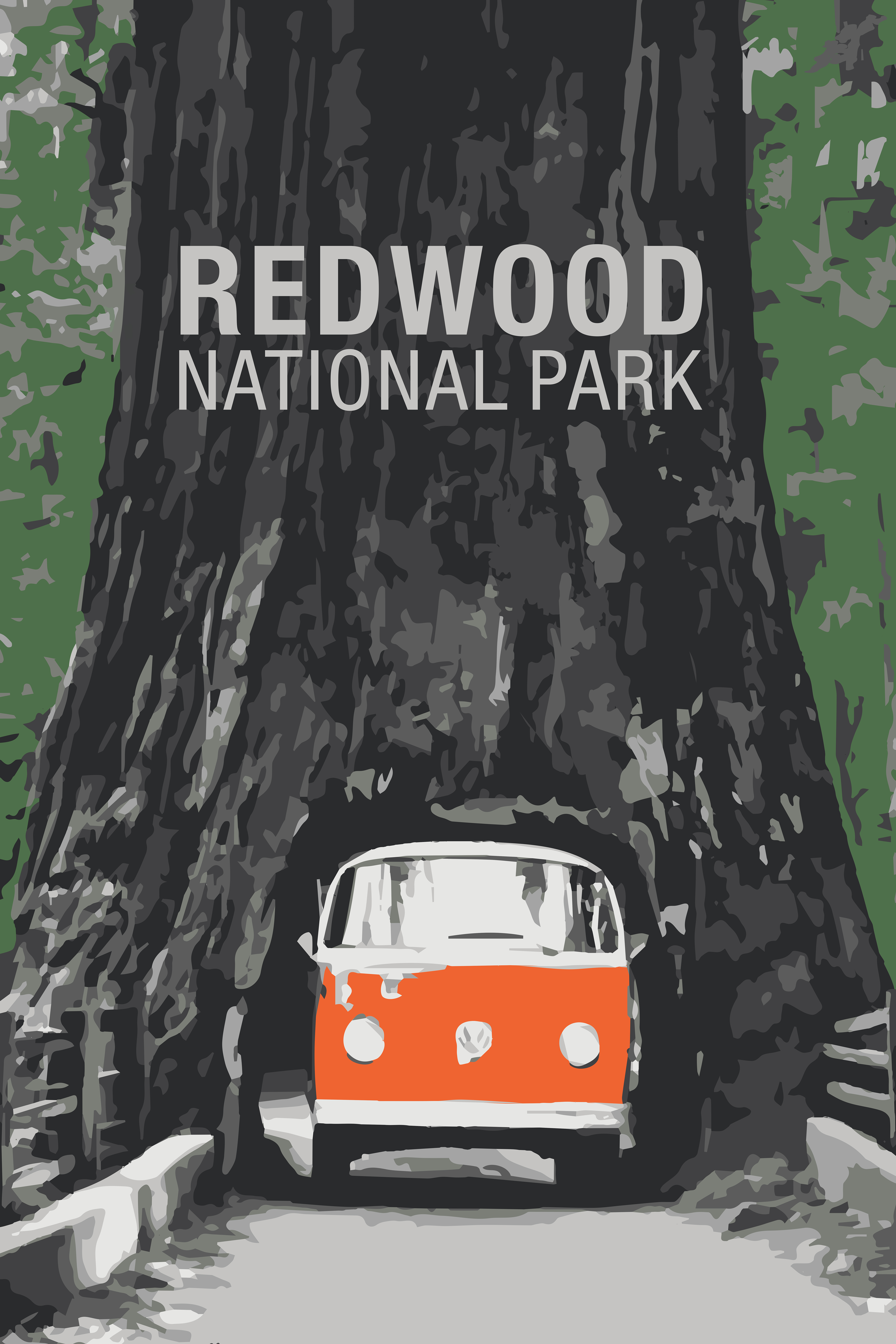
We studied mid-century travel posters from the likes of David Klein, Joseph Binder, Stan Galli and Kurt Wirth, paying careful attention to the effective use of color, simple imagery, and bold text. These final two assignments, City & National Park, deeply influenced my design style to this day. I draw heavily from bold, flat colors, simple shapes, and blocky text today.
For Firenze, I used an image trace from a photo and created a flat background that was similar to the original background.
For my National Park poster, I bounced between wanting to represent Death Valley and the Redwoods, but I ultimately decided on the Redwoods. The image traced photo I referenced quickly became something else with hand drawn elements and alterations, plus a lot of experimentation with typography. The final project was printed on a 24x36" poster, which still proudly hangs in my parents' house!
Overall, this class was incredibly challenging and I learned so many new skills and techniques I use frequently in my graphic design work professionally. It remains one of my favorite undergrad courses!