
Over the last few years, I've witnessed one of my dearest friends completely shift careers by attending a year-long intensive coding bootcamp. Recently, she and a classmate have started their own software company, Async Dot Then, and I was so excited to offer my skills to get their business off the ground in early 2021!
Madison and Randee are self proclaimed "Tech Babes" -- a direct critique of the "Tech Bros" so dominant in the tech industry, especially where Async is based in Seattle, WA.
The origin story of their name is honestly so lovely that I have stolen their language from their website: "Async and .then are two different methods in JavaScript, our first language, that allows developers to tell the code to do one thing and wait until it is finished before it does another thing. It allows developers to work with code that would otherwise run asynchronously and break everything. The catch here, is that they don't work together. They are just two different ways to do essentially the same thing. Having gone to college for things that had nothing to do with computer programing and having discovered coding in a bit of an asynchronous way in our lives, we knew without a second thought, that when it came time to name our software company we would be Async Dot Then."
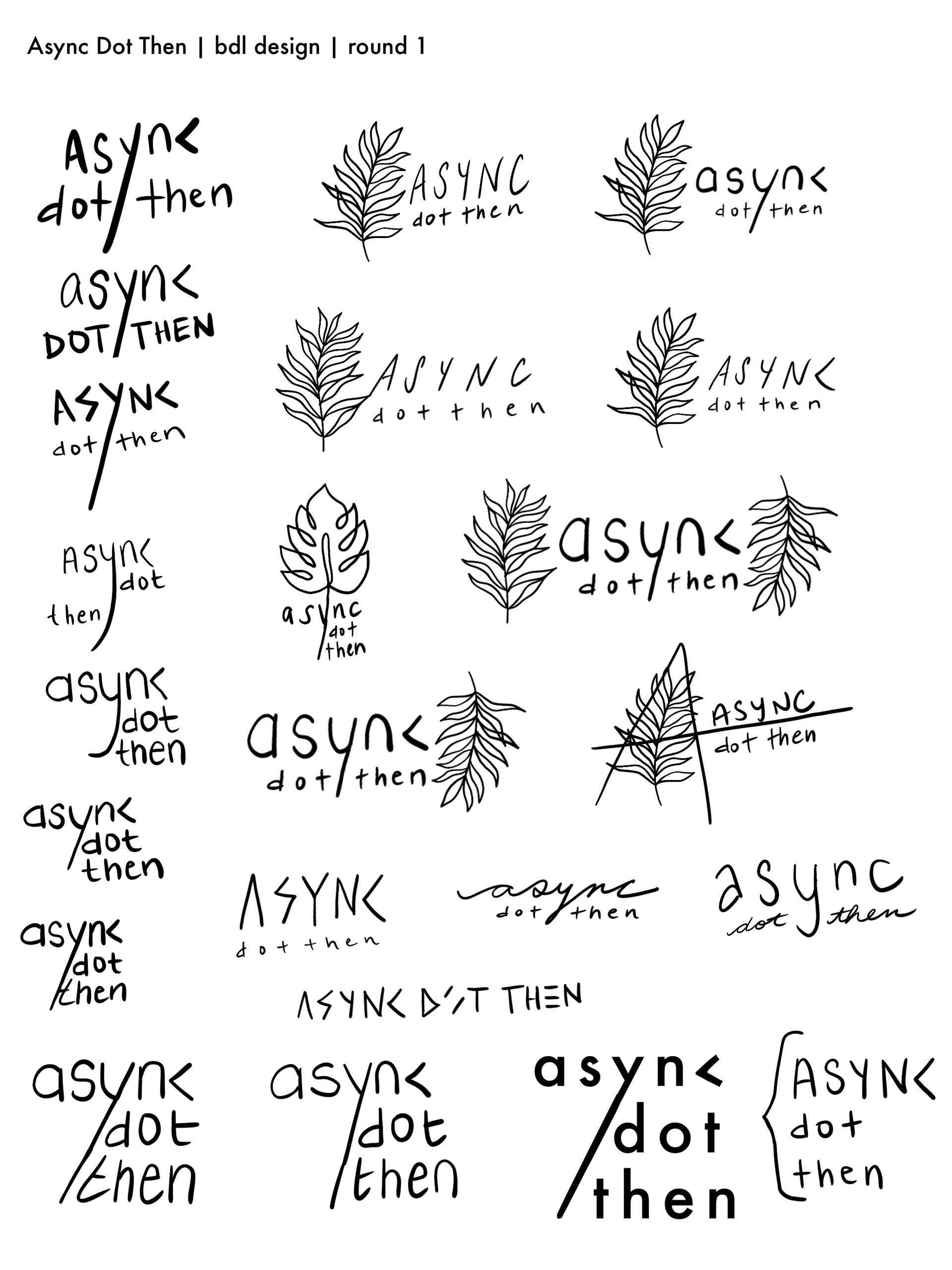
My initial round of sketches for Async involved play with extending the tail of the "y" (a homage to the / which I thought had something to do with coding) and using a < in place of the "c" (a homage to the carrot which also has something to do with coding, the folx at Async assured me!).
During our initial consultation, Madison and Randee shared that their primary goals in their brand identity were to create a feeling of accessibility, openness, and divine feminine energy. They also mentioned they were using images of ferns as placeholders on their website and had grown quite fond of them.
The fine line drawing of a fern leaf was executed pretty well from the beginning and ended up being the direction we took for logo refinement!
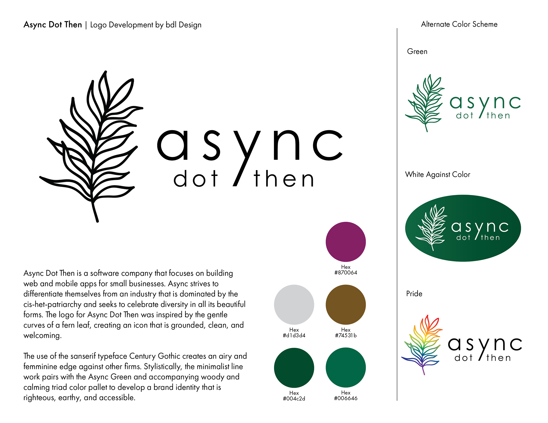
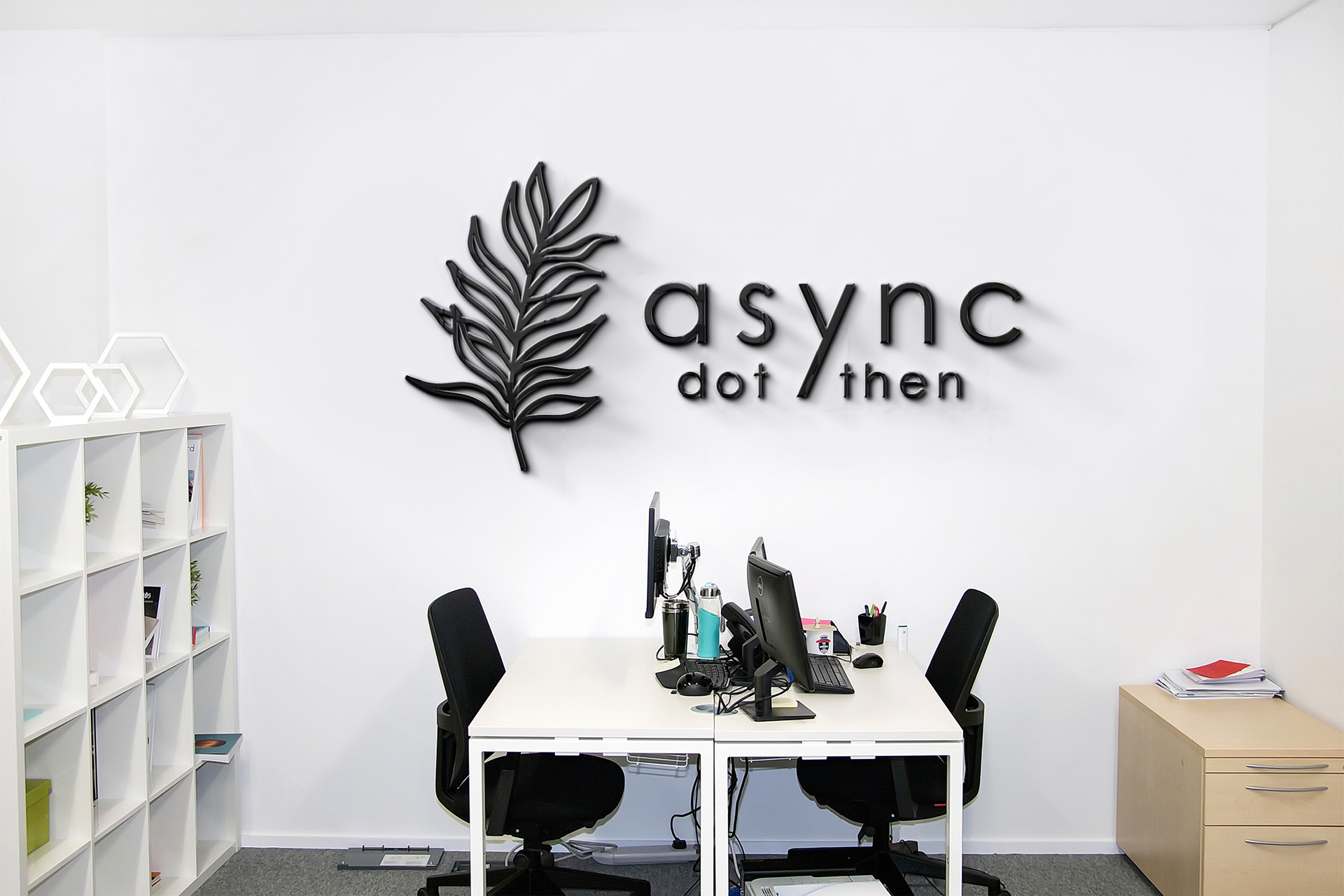
Async Dot Then is a software company that focuses on building web and mobile apps for small businesses. Async strives to differentiate themselves from an industry that is dominated by the cis-het-patriarchy and seeks to celebrate diversity in all its beautiful forms. The logo for Async Dot Then was inspired by the gentle curves of a fern leaf, creating an icon that is grounded, clean, and welcoming.
The use of the sanserif typeface Century Gothic creates an airy and feminine edge against other firms. Stylistically, the minimalist line work pairs with the Async Green and accompanying woody and calming triad color pallet to develop a brand identity that is righteous, earthy, and accessible.